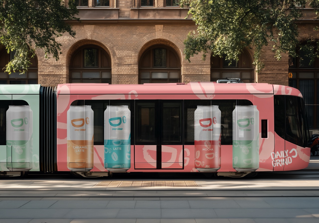
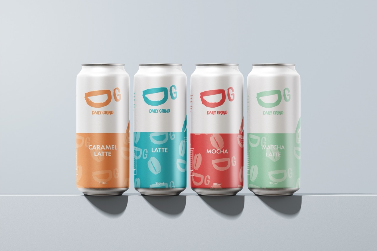
This brief explored FMCG branding and packaging. After in-depth research, I found a gap in the market for RTD coffee targeted toward a young, on-the-go audience. The aim was to create a design that felt fun, and displayed convenience for everyday use; a product that fits easily into the fast-paced lifestyle of its users.
The identity focuses on fun typography and colours to allow the brand tostand out on shelves while remaining cohesive across flavors. The branding aims to capture the energy of a daily coffee ritual, combining a youthful attitude with a sense of reliability and ease.